Programme Parameters
Foundation
8 Weeks (80 Hrs)
Online (e-LMS)
• No prior experience required — basic computer literacy is sufficient.
• A laptop or desktop with a stable internet connection.
• Willingness to complete assignments and the capstone project.
About This Course
Through interactive dashboards, predictive analytics visualizations, and patient journey mapping, participants will learn how to turn data into actionable insights, supporting decision-making and improving patient care. Across 8 Weeks, you will work hands-on with interactive dashboards, predictive analytics visualizations, and participants will learn how, then consolidate everything in a capstone project. Every participant receives a verified e-Certificate and e-Marksheet from the Deep Science & Technology Consortium.
🎯 Program Aim
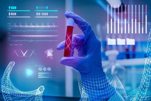
Through interactive dashboards, predictive analytics visualizations, and patient journey mapping, participants will learn how to turn data into actionable insights, supporting decision-making and improving patient care.
📋 Course Objectives
1. Get comfortable working with interactive dashboards.
2. Build practical fluency in predictive analytics visualizations.
3. Gain working command of participants will learn how.
4. Translate biotechnology theory into practical, reproducible analysis.
5. Assemble a documented case study that evidences your applied capability.
👥 Who Should Enroll?
• Master's and senior undergraduate students specializing in biotechnology
• R&D engineers and working professionals applying biotechnology in industry
• Academics and educators building research or teaching capacity in biotechnology
• Data and computational scientists moving into interactive dashboards
🚀 Key Learning Outcomes
• Confidence to reason about interactive dashboards in real projects.
• Confidence to apply predictive analytics visualizations in real projects.
• Confidence to implement participants will learn how in real projects.
• A demonstrable biotechnology project for your research or industry portfolio.
• A verified e-Certificate of competency and e-Marksheet from the Deep Science & Technology Consortium.
💎 What You'll Gain
Live & Recorded Sessions
Lifetime access to class recordingse-Certificate on Completion
Cryptographically verified credentialPost-Programme Support
Direct access to mentors & councilHands-On Experience
Notebooks, real-world code & datasetsCurriculum Outline
Visual Encoding for Clinical Audiences
• Perceptual ranking of visual channels and choosing encodings accordingly
• Colour for clinical safety: accessibility, severity scales and cultural convention
• Chart types that mislead in healthcare, and their common substitutes
Visualising the Individual Record
• Longitudinal timelines across medications, results and events
• Physiological waveform and monitoring display at the bedside
• Presenting risk scores so clinicians can calibrate trust in them
Volumetric and Multimodal Rendering
• Volume rendering, multiplanar reconstruction and segmentation overlays
• Registering and displaying multimodal studies together
• Communicating model uncertainty on top of an image
Cohort and Geographic Visualisation
• Cohort comparison, survival curves and small-multiple layouts
• Geospatial mapping of disease burden and access, and rate-versus-count errors
• Dashboards for quality improvement rather than performance theatre
Building and Evaluating Visual Systems
• Tooling choices from statistical graphics to web-based interactive systems
• Usability testing with clinicians under realistic time pressure
• Accessibility, colour-vision deficiency and display constraints in clinical settings
Technical Specifications
| Parameter | Requirement |
|---|---|
| Covered Tool / Platform | Python |
| Covered Tool / Platform | SPSS |
| Covered Tool / Platform | DICOM Viewers |
| Covered Tool / Platform | EHR Systems |
| Covered Tool / Platform | TensorFlow |
| Covered Tool / Platform | PubMed |
Frequently Asked Questions
Scholar Feedback & Reviews
Based on 0 scholar submissions
Rating Breakdown
No verified reviews published yet. Be the first to share your academic experience.
Leave Scholar Feedback
Your rating will help prospective scholars. Ratings below 3 stars are routed privately to the faculty mentor for immediate response.